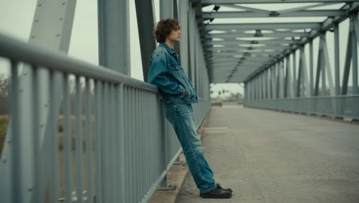
Faded light‑blue denim looks more intentional as a full look than saturated indigo, precisely because it has surrendered intensity. Washed fabric pushes blue toward a narrow band of lightness and chroma, so jacket, shirt, and jeans all sit in roughly the same zone on a color wheel and on a value scale, which our eyes read as one field instead of separate items fighting for attention.
Deep indigo, by contrast, exposes every mismatch. Small shifts in dye formula, weave density, or optical brighteners create different spectral reflectance curves, so one pair leans violet, another greenish, another almost black. Those micro‑shifts translate into hard edges of contrast when garments meet at the waistband or cuff, breaking the illusion of a single column and making the outfit look pieced together rather than continuous.
Light wash also cheats on silhouette. Higher lightness compresses perceived depth, so seams, pockets, and fabric overlaps throw softer luminance contrasts than on dark denim, where every crease becomes a sharp contour. With fewer value jumps and milder saturation, the body reads as one pale vertical block, closer to a monochrome rendering than to a stack of separate garments, which is why a bleached trucker and jeans can feel almost like a uniform.