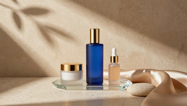
Blue glass catches the eye hardest when gold enters the frame. Along a warm metallic edge, the bottle's cool hue seems to sharpen, as though the color had found a louder voice. That asymmetry is the point. It is simultaneous contrast, operating before taste or branding gets a vote.
The pairing is more exacting than it first appears. In opponent-process theory, visual signals run through channels that set blue against yellow and red against green; a gold field, often rich in yellow-orange light, pushes nearby blue toward apparent saturation. Contrast does the work. Because gold also throws specular highlights and shifts with the viewing angle, it supplies changing warm cues while the bottle holds a steadier blue identity. Place the same bottle beside gray, and the signal loses friction. Put it beside muddy brown, and weak hue separation can make both colors look tired.
Designers should resist treating gold as mere luxury trim. Its payoff is perceptual economy: a modest warm border can make blue packaging command attention without adding more dye, light, or copy. Gold keeps moving. Yet the arrangement remains delicate; too much gold can turn the field into glare and flatten the blue. At rest, bottle and foil conduct a quiet argument, and the eye chooses the blue.