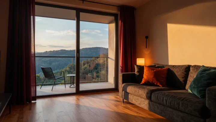
Brown warms no air. Across a wall, its red and yellow wavelengths arrive as reflected light, not thermal energy, yet the eye reads the pigment through learned associations with wood, earth, skin, and fire. The thermostat stays indifferent. What changes is appraisal: a room begins to advertise shelter rather than exposure.
That judgment is more potent than most decorating advice admits. It is no magic. In color constancy, the visual system discounts illumination, while opponent-process coding sorts chromatic signals through prior experience; brown, a low-luminance red-yellow appearance created by context rather than a single spectral band, borrows memories of timber, soil, leather, and fire without producing their heat. Context carries the case. Matte surfaces, amber light, visible grain, and restrained contrast can reinforce affective appraisal, making boundaries seem gentler and furnishings seem less exposed. This is why a painted sample rarely tells the whole story: surface, illumination, and neighboring colors act as a perceptual coalition, altering the message before furniture enters. The body may follow. Environmental psychology links color and material cues to preference, perceived coziness, and approach behavior, although responses vary with personal history, lighting, and the surrounding palette. No pigment commands calm. A glossy brown beside harsh white light can feel heavy or stale; the same hue, softened by texture and shadow, can suggest enclosure. The air remains unchanged. Yet beneath that ordinary ceiling, the room can seem to hold its breath less tightly.