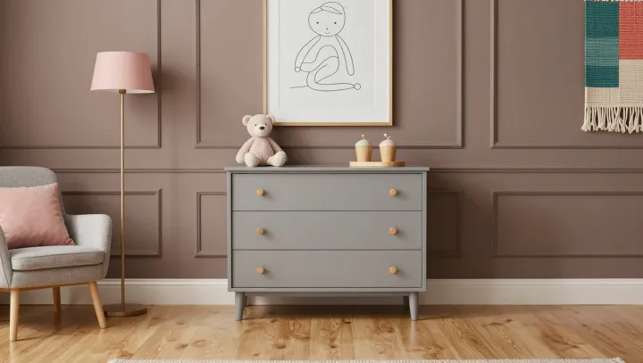
Light plays favorites. The same gray paint that feels soft in one corner can register as sharp and chilly on the opposite wall, because the light striking it is never neutral or uniform across a home.
At the center is a blunt fact: gray has no fixed identity on your wall; it is a moving average between pigment and illumination, filtered through human visual adaptation and color constancy in the eye and brain. North-facing rooms often receive cooler, indirect daylight with a higher correlated color temperature, which exaggerates blue undertones in ostensibly balanced grays. South-facing spaces, flooded with warmer, lower-angle sun, pull the same formula toward beige, especially on matte surfaces with higher diffuse reflectance that scatter warm wavelengths deeper into the room.
Even artificial light tilts the verdict. Warm white LED or incandescent sources, rich in longer red and yellow wavelengths, can push a neutral gray toward taupe, while cool white LEDs, with a spectral power distribution spiked in shorter blue wavelengths, tilt the same paint toward steel. Add in nearby colored surfaces bouncing indirect light, and the paint becomes a passive screen for those reflected hues, not an independent actor. For homeowners and designers, the practical move is unsentimental: test large swatches on multiple walls, under both daylight and lamps, and accept that any color decision is really a lighting decision in disguise.