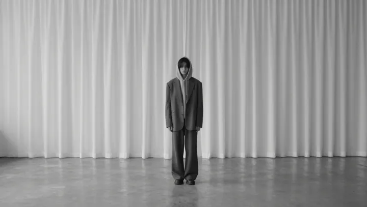
That gray suit over a hoodie is a lie. The fabrics stay cheap, yet the eye suddenly files the look under luxury because perception obeys hierarchy more than price. In a strict black‑and‑white palette, the brain leans on luminance contrast and edge clarity, not on fiber content or stitch density.
Here is the uncomfortable point. Tailoring still signals authority even when the suit is flimsy, because pattern cutting creates sharp vertical lines that read as structure in Gestalt psychology, while the hoodie supplies volume and texture that suggest comfort and youth. Stack them, and you get a layered signal: competence wrapped around ease, which advertising research repeatedly links to aspirational status cues.
Color does even more work than cut. Strip everything to grayscale and you trigger the same value‑based processing used in object recognition, where the visual cortex prioritizes contrast boundaries over material identification. A mid‑gray blazer against a darker hood and a pale T‑shirt forms a clean figure‑ground relationship, so the total silhouette feels intentional, almost art directed, even if the polyester is squeaky.
Then comes association. Monochrome has been baked into luxury branding through decades of minimal packaging, runway styling, and editorial photography, creating a mental shortcut known as a heuristic. The suit‑and‑hoodie combo simply rides that shortcut: same bargain rack, same pattern flaws, yet filtered through a palette and structure that whisper money before the mind has time to check the label.