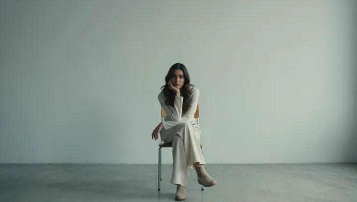
An all‑white outfit looks richer on pale gray than on pure white. That is not taste; it is optics and branding strategy hiding in plain sight. The slight shift in value between clothing and backdrop creates edge contrast, allowing seams, drape, and silhouette to register without the distraction of color noise. What appears minimal is, in practice, a controlled experiment in luminance contrast and figure‑ground separation that mimics how luxury houses present product against soft studio neutrals.
The surprise is that low contrast can feel sharper than bold color. White on soft gray compresses the dynamic range so the eye stops chasing saturation and starts reading surface data: fiber density, weave regularity, and how fabric breaks at the elbow or knee. When the palette is stripped back, cues like tailored shoulder lines and clean hemlines gain weight, producing a composure similar to high‑end lookbooks, where art direction leans on subtle value shifts instead of aggressive hue blocks.
Most of the price signal lives in this restraint. A nearly colorless pairing echoes luxury packaging design, which relies on controlled negative space, tight value bands, and precise edges to suggest cost. The worn, pale‑gray background functions as a visual buffer, separating the white outfit from the environment just enough to assert intention, so what could read as basic instead lands as edited, deliberate, and therefore expensive.