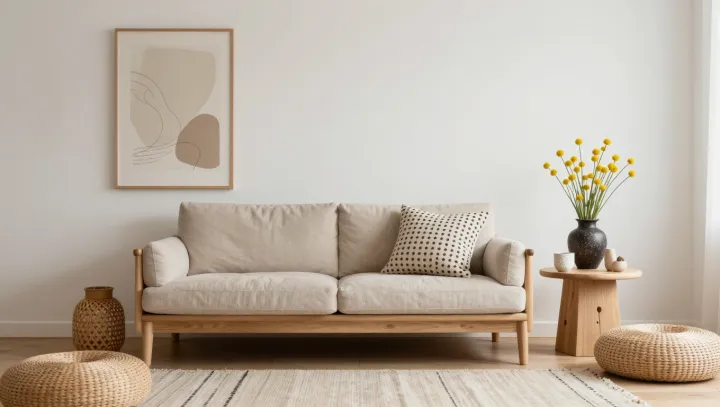
White walls were never about fashion; they were survival hardware. In Nordic interiors, pale surfaces bounce scarce daylight deep into rooms, while matte finishes cut specular glare that strains the eye and forces constant pupil readjustment.
The style’s real power lies in what it removes. Sparse layouts, low furniture profiles and clear circulation lines reduce visual noise, which psychologists describe as excess stimuli competing in the visual cortex. When objects are edited down, saccadic eye movements slow, cognitive load drops, and the brain no longer runs a constant threat-detection script across every shelf and corner.
Soft contrasts finish the job. Instead of hard black‑white clashes, Nordic schemes lean on narrow contrast ratios, natural wood and textiles that deliver high luminance but gentle edges, easing accommodation and convergence in the eye muscles. Add biophilic design cues—plants, organic textures, daylight-mimicking color temperature—and the nervous system receives the same calming signals it gets in open, snow-bright landscapes, which is why a look born in darkness now reads as psychological daylight almost everywhere.