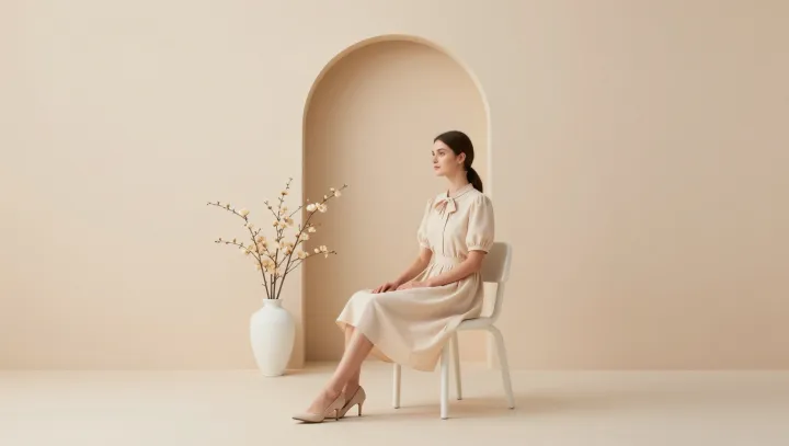
A nearly colorless portrait can lift a room more than a wall of saturated paint. Light, not pigment, does most of the work here, and the eye quietly obeys the physics. With a pale or grayscale face, the composition often carries higher luminance contrast and cleaner edges, which makes ambient light bounce and register as clarity rather than clutter.
Bold hues fight for attention. They raise what psychologists call arousal, and that can feel like glare even when the light level, or illuminance, is identical. Near-monochrome portraits shrink the palette, so the brain has fewer wavelengths to process and less chromatic adaptation to perform. The result is lower cognitive load, smoother saccadic eye movements, and a softer pulse of attention across the wall.
There is a physiological angle too. When a portrait leans toward soft neutrals that echo daylight tints, it cooperates with circadian rhythm cues instead of hijacking them with heavy reds and electric blues. The skin tones read as calm, the shadows stay legible, and the background recedes. What looks like an absence of color is often a deliberate edit, turning down the volume so the room itself can breathe.