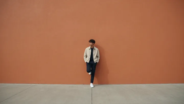
Color contrast, not garment count, decides whether an outfit feels sharp. Against a bold orange wall, the eye stops fighting clutter and starts following hierarchy: dark at the base, light through the torso, saturated in the background. That stacked order turns three separate elements into one vertical column, so the look reads as deliberate rather than busy.
The surprise is that the light jacket actually cleans up the trousers. By sitting between the deep value of the dark tapered legs and the high‑chroma orange field, it acts as a buffer in terms of both luminance contrast and hue contrast, two textbook levers in color theory. The trousers become the visual anchor; their taper and solid tone are amplified because the jacket and wall do the work of framing, not competing. Edges look straighter. The silhouette looks narrower. What could feel like noise instead behaves like color blocking, with clear figure–ground separation that makes every line look sharper than it would in front of a neutral wall or under a matching dark coat.
So the outfit is not simpler. The perception is. The dark–light–orange stack edits the scene for the viewer before they even know they are judging clothes.