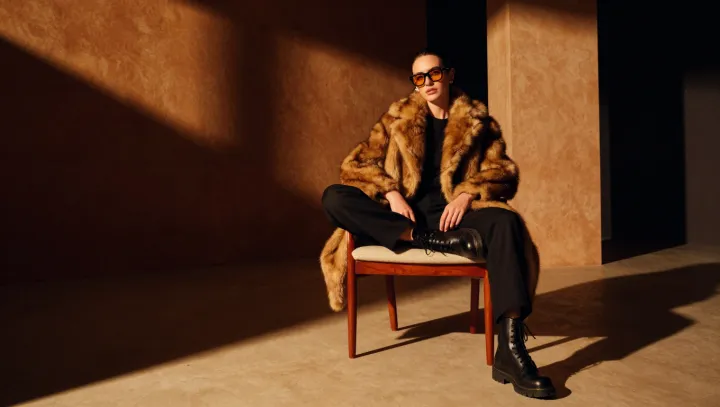
The cleverest use of leopard print begins under a charcoal lapel, where its tawny ground and dark rosettes lose their growl and take on the quiet duty of a neutral. That is the smarter reading. When the pattern is framed by a precise shoulder and a straight trouser, proportion does the persuading, not volume. The eye finds order first, then notices the animal charge beneath it.
Restraint wins here. Tonal dressing gives the print an adult register: stone, tobacco, ink, olive, and softened black let irregular spots act like grain in leather rather than a billboard. Keep lines clean. A wool coat, a narrow belt, or a sharply cut skirt supplies structure, while competing surfaces make the eye restless. The point is not to tame the motif into invisibility, but to give its visual noise a measured frame. In color theory, the effect rests on value control; low-contrast companions quiet the pattern without bleaching its character.
Accessories should nearly vanish. A plain loafer, small gold hoop earrings, and a firm leather bag supply punctuation, but glitter, logos, and stacked jewelry break the spell because leopard already contains movement. Let it breathe. The result is authority without theater, an effect often lost when the print is asked to carry every dramatic note. The most persuasive outfits refuse the old bargain in which animal print must announce itself from across a room. Worn close to the body of a disciplined palette, it becomes something rarer: a familiar wildness, held in composure, like a shadow caught beneath tailored cloth.