Cool textiles do more. Against oak and camel upholstery, a blue-gray cover shifts simultaneous contrast: the eye reads neighboring warm surfaces as richer, while the cover appears to withdraw, a perceptual effect tied to hue temperature and relative luminance. The room gains air. It is relational, not structural.
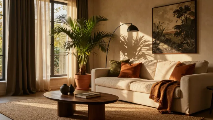
Greenery is the sharper instrument. Leaves interrupt large warm planes with irregular edges and gradients of reflectance, so the gaze has smaller color fields to process rather than one continuous block of wood and fabric. This is no decorating trick. Chromatic adaptation recalibrates visual response after sustained exposure to warm hues; a green plant can supply a cooler counter-signal through opponent-process coding, making the base palette feel less enclosing without changing its material mass. Its shadows matter too. Fine foliage casts broken shade, lowering perceived visual weight and giving light a route across the sofa. Because foliage carries many small highlights, it can increase perceived spatial depth even when it occupies little floor area.
Scale decides the result. A pale blue textile with a modest lightness contrast can open the composition; a dense forest-green mass may instead deepen it, especially beside dark walnut. Nothing has moved. That restraint is the point. Yet the warm room, interrupted by receding color and living edges, stops reading as a single heavy sentence and becomes a place where the eye can pause.