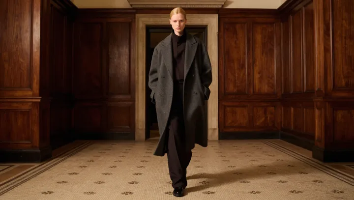
A gray overcoat makes a dark brown suit look dearer not through agreement but through refusal: it sits higher on the luminance scale, giving the suit a clean boundary instead of letting both garments merge into one autumnal mass. The effect is quiet. The boundary suggests control rather than accident, and control is often mistaken for expense.
This is visual science. Simultaneous contrast shifts perceived lightness: a mid-gray surface makes adjacent brown appear deeper, particularly when wool catches diffuse daylight, while brown gives gray restraint rather than blandness. Chroma need not match. Near matching can cheapen the pairing, because the eye seeks hierarchy and finds hesitation when neighboring tones occupy the same value range, much like a decision delayed at the fitting-room mirror. Tonal separation wins. It permits texture, lapel line, and cloth weight to register without theatrics, even when neither garment carries a conspicuous label.
Distance creates expense. Charcoal over espresso tailoring can collapse into murk under weak indoor light, where reflectance differences narrow, each fabric loses its edge, and the silhouette loses depth. Medium gray restores distance. Like the margin around fine typography on a spare printed page, it is not the message but the interval that lets the message command attention. Coordination is the trap. Let brown stay dark and gray stay lighter; elegance begins when colors cease trying to be friends.