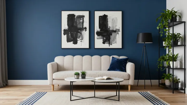
Flat blue walls and white trim are not a design cliché; they are a metabolic shortcut for your brain. Against that low-contrast, cool spectrum, the visual cortex can lean on its default wiring, using fewer spikes of neural firing to maintain a stable scene, which keeps the space feeling “fresh” instead of demanding.
The core issue is energy, not taste. Color information is encoded by opponent-process channels and processed in regions such as V1 and V4; when a room is dominated by narrow-band blues and clean whites, those channels get long, predictable signals that favor neural adaptation and reduce overall cortical excitation. Introduce high-saturation reds, dense patterns, and sharp luminance edges and you force constant micro-corrections in eye movements, contrast gain control, and chromatic adaptation, creating what researchers describe as low-level sensory noise.
So the “bold” room that feels exciting at first behaves like a tab that never stops auto-refreshing in your visual system. Saccades work harder, photoreceptor recovery slows, and the brain must perform more inhibitory signaling just to stabilize the field. The blue-and-white room, by contrast, sits closer to environmental baselines like sky and diffuse daylight, allowing perception to idle at a lower energetic cost while still reading as clean, open, and mentally breathable.