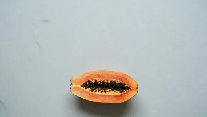
Orange does not whisper in a grayscale room. It yells. Strip a layout to black, white, and gray, and you create a visual vacuum that basic color theory says orange rushes in to fill, amplified by simultaneous contrast and the way cone cells spike in response to warm wavelengths.
The bold claim from designers is simple. Remove chroma elsewhere and you hand orange a monopoly on attention. Against high-value white and low-value black, orange sits at a mid luminance level that keeps strong contrast edges alive without collapsing into glare or mud, so every button, badge, or icon in that hue becomes a priority signal to the visual cortex under the rules of figure–ground segregation.
More quietly radical is what the brain does next. With no competing hues, the opponent-process system exaggerates the warm–cool axis, so orange is coded less as a color and more as an alert state, not unlike a permanent hazard sign. That is why safety gear, warning labels, and call-to-action elements so often converge on the same strip of the spectrum when everything around them stays drained of color.