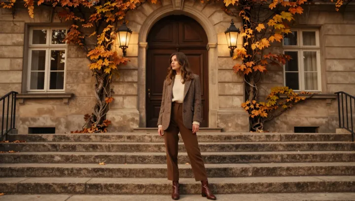
An outfit looks rich before anyone sees fabric or stitching. Color hits first. When head‑to‑toe tones sit in the same warm register as limestone, sand, and ivy, the eye reads unity and the mind upgrades it to status.
The sharper claim is this: the brain shortcuts “cohesive palette” into “expensive object” because of how visual hierarchy and color constancy work together. Our visual cortex groups similar hues as one object through the Gestalt principle of similarity, so a jacket, knit and trouser in aligned warm undertones fuse into a single, calm block. That low‑noise field stands out against the usual clash of retail brights, creating a contrast effect that feels deliberate, curated, controlled.
Equally counterintuitive is how earthy references beat neon for status. Surfaces that echo warm stone and ivy mimic architectural materials associated with permanence and high replacement cost; behavioral economists would call this a status heuristic. Your brain has learned that limestone facades and manicured greenery usually sit around money. So when cotton, wool and leather occupy that same color temperature band, the association spills over. No logo is necessary. The palette itself whispers that someone paid to edit.