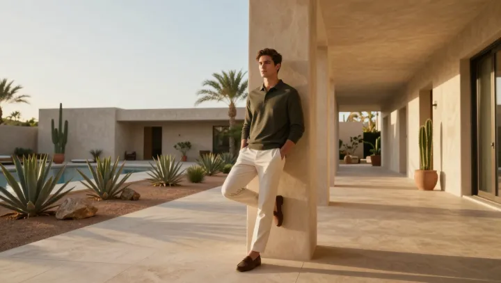
A column of quiet winter neutrals often looks richer than any bright coat. That is not an accident; it is how the eye works. When color contrast drops, the brain stops scanning for novelty and starts auditing structure, proportion and texture. A sand sweater against oatmeal wool trousers and a stone coat forms one continuous signal, so every seam, drape and fiber becomes legible instead of buried under competing hues.
The more restrained the palette, the more obvious the intention. Designers speak in terms of value, saturation and negative space; by narrowing those variables, you create a kind of visual closed-loop where nothing feels random. A near-monochrome outfit lets cashmere, brushed flannel and polished leather do the talking, and quality materials have a higher return on attention than a single loud scarf fighting a bright knit, a colored bag and graphic sneakers all at once.
There is also a status code at play. High-end wardrobes rely on repeatable systems, not one-off statement pieces, because consistency builds a recognizable silhouette and an implicit brand moat around the wearer. When winter outfits sit in the same soft range of taupe, grey or camel, they read as a deliberate series rather than isolated looks. A flash of color still works, but against that quiet field it becomes a precise accent, not a distraction.