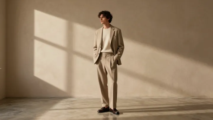
Restraint wins. Beneath a blazer's lapels, a crewneck knit that sits near the jacket's chromatic value lets the eye read one vertical field, rather than halt at a line across the chest. The effect feels deliberate. Contrast carries a tax, especially when the jacket already has structure.
The sharper choice is usually quieter. The eye edits quickly. When jacket and knit share a close value range, luminance contrast drops, so attention moves to the blazer's shoulder line, lapel roll, and proportions instead of treating the torso as a color-blocked interruption. This is visual hierarchy at work. Simultaneous contrast makes adjacent hues appear farther apart; high contrast can exaggerate a knit's boundary and flatten the jacket's architecture. The garments stop competing.
Exact matching, though, is a trap. Avoid uniforms. A tonal pairing needs a small shift in hue, texture, or reflectance: a matte wool blazer with a smoother merino crewneck, for example, keeps the field coherent while giving the surface depth. The payoff is control. Darker knits can still work under lighter jackets when the value gap stays measured and the collar remains clean. A single color field lets cut speak first; the rest arrives like a low note after the chord.