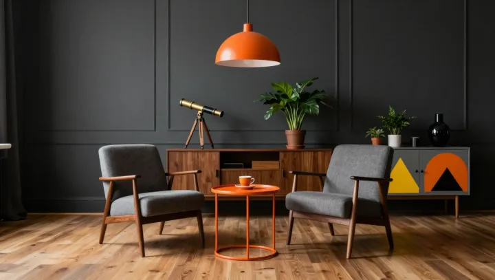
A little orange does more work than an orange wall. Against charcoal walls and gray seating, a small accent gains force precisely because it interrupts a restrained field of color. The contrast catches the eye before the room's quieter details have had a chance to register. Restraint gives color authority.
Scarcity, not saturation alone, makes the accent persuasive. Visual salience describes how a feature stands out from its surroundings, while simultaneous contrast helps explain why adjacent colors can alter one another's perceived appearance. An orange cushion against gray has fewer rivals for attention than the same cushion in an orange room, where repetition makes the color less distinctive. Scale matters here. Cover a large surface in orange and the eye may begin to treat it as part of the setting rather than an interruption. The larger area can still feel intense, but it may lose the small accent's sharp claim on attention.
The neutral background succeeds because it is not left to do all the work. Warm wood shares some of orange's warmth without matching its intensity, while greenery introduces another color through leaves and texture rather than another block of paint. Together they soften the distance between the accent and the gray seating, making the scheme feel connected rather than abruptly divided. Placement matters, too. A few related accents can guide the eye around the room, but scattering orange across every surface would weaken the contrast that gives it emphasis. In the stillness of the gray room, that small flash holds its ground.