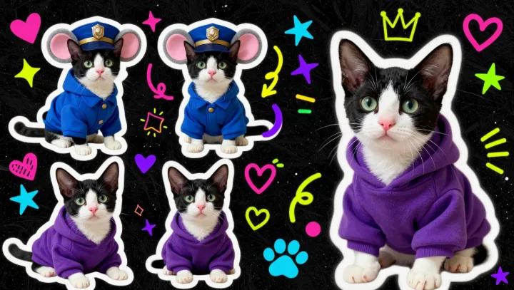
Black fur wins fast. Against a pale hoodie, its low relative luminance creates a hard boundary, while the cat's ears, paws, and tail remain readable after pinks, blues, or patterns disappear. The effect is not a color surplus. It is value contrast doing the first, loudest job.
The eye is ruthless. Figure-ground segregation, the visual process that separates an object from its background, gives a dark cat shape priority when surrounding colors compete for attention. Think of it as a high-priority interrupt in an operating system, though the actual mechanism involves retinal contrast signals and cortical edge detection. Less chroma means less static. The silhouette gets the bandwidth.
Minimal palettes scale better. At sticker size, fine color distinctions often collapse, especially when fabric texture, shadows, and phone-screen compression enter the frame; black keeps the contour intact through luminance contrast. That creates visual hierarchy without decorative clutter. A dark cat can read as mischievous, sleek, or defiant because viewers fill the empty space with attitude. Fewer pigments, sharper signal.