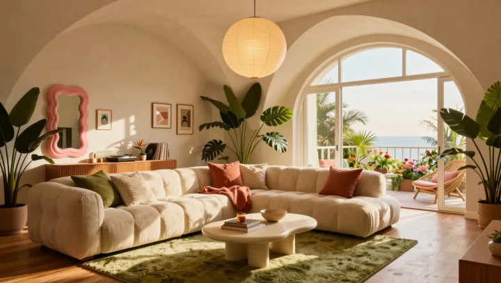
Warmth is not additive. An amber pendant can pour a low, honeyed glow across timber and brass, yet a blue-gray sofa and a pale rug may pull the eye toward a different thermal reading, because simultaneous contrast makes neighboring hues alter one another's apparent temperature. The room then splits.
Scale is the quieter offender. A sofa with broad, low volumes can make a fine-legged lamp appear fussy, while a postage-stamp rug weakens the sofa's claim to the floor; because spatial frequency, proportion, and negative space govern perceived mass, the eye reads the pieces as competing scales rather than one interior. Texture cannot settle that dispute. A thick weave may add comfort, yet it cannot give a small rug the visual footprint required to anchor a large seat.
Light cannot rescue a quarrel. Color alone is a poor alibi. Correlated color temperature matters, but luminance distribution matters as much: a warm lamp aimed at one small pool leaves larger planes under dim, cool-leaning ambient light, and the resulting contrast can make warmth seem theatrical rather than lived in. Perceptual grouping favors repetition. Match undertones, volume, and light spread before buying another cushion. Otherwise, the amber pool remains a small fire inside a room that has chosen winter.