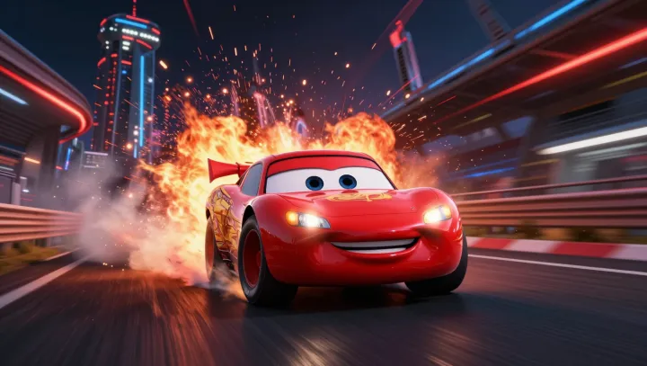
The low red body tells its story before any wheel turns: its broad stance, compressed roofline, and small apparent ground clearance make Lightning McQueen read less like transport than stored velocity, as the eye compares width against height and treats the resulting aspect ratio as a cue of stability and force. Speed arrives first. That inference is not magic but pre-attentive visual processing, through which silhouette is sorted before viewers consciously inspect details. A low center of mass also belongs to racing logic, because reduced body roll can support cornering control, and the cartoon borrows that mechanical grammar without needing a moving frame.
Color does the louder work. Red is not universally interpreted the same way, yet in much popular visual culture it is repeatedly recruited for heat, warning, exertion, and competitive intent; against pavement or open track, high chromatic contrast makes the car claim attention with little delay. The number and grin help. Still, they decorate a decision made by proportion: wheels pushed outward, cabin pressed downward, nose aimed ahead. This is visual semiotics with an aerodynamic accent, not a literal drag-coefficient calculation. The design turns a static outline into an expectation of acceleration before sound or action can intervene. Before motion begins, the eye has already spent it.