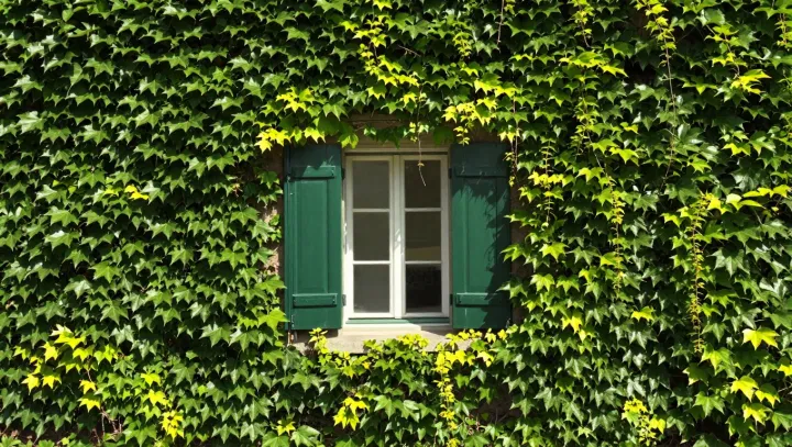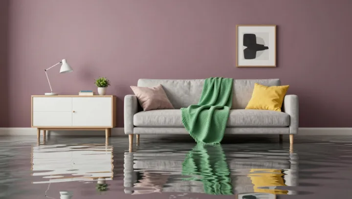
A sparse room with a few geometric volumes and a tight color palette can feel unexpectedly more alive than a heavily decorated interior crammed with patterns and objects. The difference is not taste but visual information management: when shapes and hues are reduced, the brain can process the scene with less cognitive load and build a stronger overall impression.
Designers talk about visual entropy here. Dozens of competing details raise entropy, scattering attention into small, disconnected fragments. In a room built from simple rectangles, circles, and planes of two or three related colors, entropy drops. Edges, alignments, and color blocks become legible, so the eye can trace clear vectors across the space instead of stalling on noise.
This clarity allows another mechanism to kick in: gestalt perception. With fewer elements, principles such as figure–ground separation and similarity work harder, pulling shapes into coherent groups and rhythms. A single contrasting accent, placed against a restrained background, gains the kind of visual leverage that a dozen ornaments cannot match, creating a sense of movement, hierarchy, and unity in the same stroke.