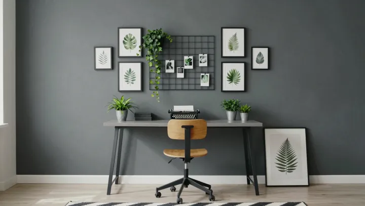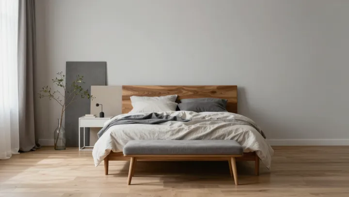
Light hitting your walls is already editing your face before you even reach the mirror. Indoor lighting, wall paint and surface finishes interact through color temperature and spectral power distribution, shifting how warm or cool tones register on skin and fabric. Under one bulb, a beige sofa reads creamy; under another, it jumps to sallow or gray. The same top can look rich and golden in the store, then oddly flat in your living room.
Color science calls this metamerism: two colors that match in one lighting condition but diverge in another because their spectra differ. Your visual system adds another twist through color constancy, a neural process that tries to correct for the light source and often fails indoors, especially with mixed LEDs. Walls painted in strong warm neutrals can bounce amber wavelengths back onto your skin, exaggerating redness and making classic warm makeup feel heavy. Cooler, low-chroma walls can reflect more balanced light, letting so-called cool undertones appear clearer and more even.
Designers now treat paint and lighting as a single system rather than separate choices. They test swatches under the actual luminaires and compare how skin, wood and textiles shift across several correlated color temperatures and color rendering index values. The practical takeaway is simple: before you blame your foundation shade or your sofa fabric, test your walls and bulbs, because the room may be the real stylist.