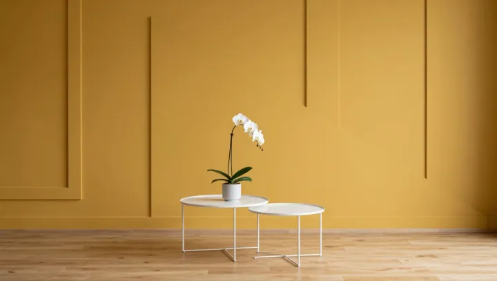
The softest “yellow” in a room is usually a lie. What designers push instead is a milky cream, so drained of saturation that it hovers between white and pastel, yet it registers in the brain as gentle daylight rather than pigment. That sleight of hand rests on how the human visual system chases balance, not accuracy, when it judges color and brightness on surrounding surfaces.
Calm starts with a compromise. Pure yellow paint spikes long- and medium-wavelength cones, increasing retinal luminance contrast and making edges, corners and shadows appear harder, even when the light level is modest. A desaturated cream, nudged toward a warm off‑white, keeps spectral power closer to neutral, so chromatic adaptation shifts the apparent white point until the walls seem to glow without shouting. The room feels brighter because the average reflectance is high, yet softer because no single wavelength dominates the field of view.
Designers treat this as a quiet form of environmental ergonomics. By tuning hue, value and saturation to sit just above standard white on the Munsell scale, they leverage simultaneous contrast and color constancy to blur boundaries and reduce perceived glare, especially under mixed LED and daylight. The wall reads as a friendly yellow only in context, while in isolation it is barely more than cream, proving that comfort in color is less about the paint chip and more about the eye’s constant act of editing.