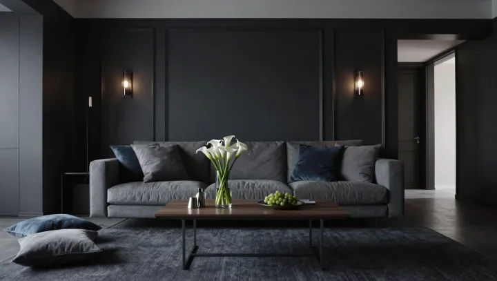
Blue paint does something bluntly practical to your brain. It dampens arousal in the autonomic nervous system while keeping visual processing sharp in the primary visual cortex, a pairing that feels calm rather than dull. Low-saturation blues sit near the natural ambient tones of sky and distance, so the visual system treats them as background, not as an alert signal that demands constant monitoring.
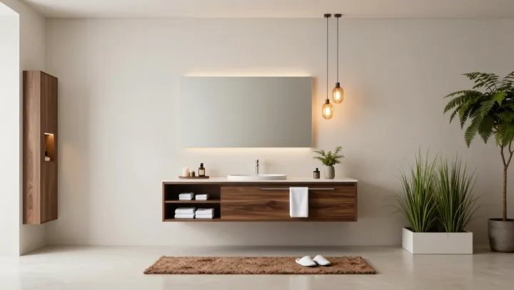
White furniture then acts like a noise filter. By reducing chromatic contrast and edge density, it lowers what neuroscientists call perceptual load, so the frontoparietal attention network does not have to keep re-prioritizing every object in the room. The space feels legible at a glance. Your eyes settle quickly. Mental effort drops.
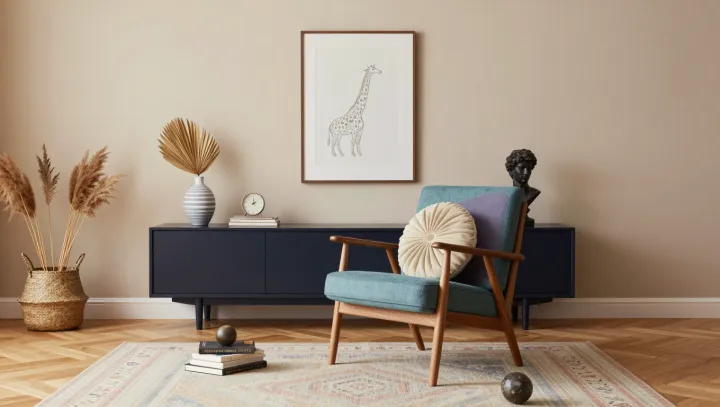
Bright, saturated colors, by contrast, are attention magnets. They spike activity in color-opponent pathways and keep the locus coeruleus nudging the release of norepinephrine, a neuromodulator tied to vigilance. That hit feels energizing at first. Over repeated exposure, though, the system pays a tax: microbursts of orienting, tiny shifts in saccades, incremental fatigue in executive control. The room is not loud. Your attention budget is.