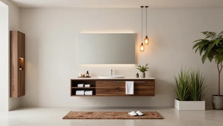
Bare wall. Empty counter. Silent floor. What looks like wasted real estate in minimalist interiors is, in fact, a kind of neural conservation plan, built on the brain’s limited capacity for processing simultaneous stimuli and its bias for simple, high-contrast organization.
Designers betting on emptiness argue that the brain does not relax in front of beauty; it relaxes in front of clarity. Visual neuroscience backs that hunch: when the visual field is crowded, the visual cortex must perform more figure–ground segregation and feature binding, raising cognitive load. Each object edge, color shift, and texture change demands extra saccades and working memory updates. Large unbroken planes of wall or floor, by contrast, reduce the number of competing signals, letting the brain group what remains into clean Gestalt units that feel legible at a glance.
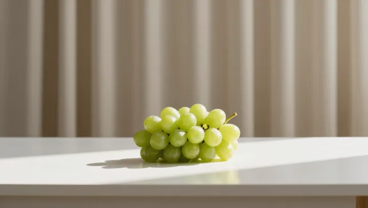
The surprise is that the empty zones do the heaviest work. Those gaps function as visual buffer zones, giving each remaining object its own perceptual halo, which lowers interference and improves attentional control. Environmental psychology studies on clutter show higher heart rate and cortisol in dense rooms; stripped-back spaces show the opposite pattern. In high-end minimalist projects, that science becomes a design brief: leave deliberate voids, so that every line and object can be read in a single, calm breath.