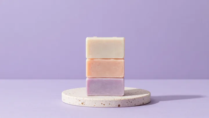
Three pastel soap bars on a white sink make a harsher critique of branding than most conference decks. Nothing moves. Nothing blinks. Yet the eye lands on the lightest bar first, then slides to the one with the sharpest edge, then settles on the bar framed by the widest margin of tile, exposing how brightness, edge contrast and negative space silently assign rank long before any logo arrives.
The uncomfortable truth is that cleanliness is mostly typography without letters. Human visual cortex, primed for edge detection and figure–ground segregation, equates high contrast borders and even spacing with order, and order with hygiene. Uniform color temperature across the three bars reads as “controlled environment,” while any shift toward visual noise—mixed hues, crowded patterns, competing focal points—dilutes that signal and makes the scene feel less sanitary even if the formula is identical.
Brand textbooks often bury this under jargon about equity and personality, yet those theories collapse when the bars trade places. Put the chipped bar in the visual center and perceived cleanliness drops; anchor the smoothest one at a strong grid intersection and the set suddenly feels premium. Here, Gestalt grouping, luminance contrast and margin discipline do the heavy lifting, leaving logotypes as latecomers to a decision the eye has already made.