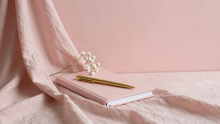
Pink gets credit. Across a desk, a low-saturation surface can soften visual contrast, while reflected light and nearby materials alter what the eye registers; pigment is not dispensing serenity like a sedative. The room decides. Furniture scale, screen brightness, and a lamp's color temperature enter the verdict before anyone names the shade.
Paint charts mislead. Color constancy helps the visual system discount changes in illumination, yet it leaves social meaning intact because associative learning can link pale pink with bedrooms, cosmetic packaging, childhood objects, or hospitality, according to a viewer's prior encounters. Memory takes over. Chromatic adaptation changes sensitivity after prolonged exposure to surrounding hues, and affect priming can tilt an initial response before deliberate judgment arrives, while semantic appraisal filters the scene through prior experience, including associations with care, commerce, or confinement.
Decorating advice wobbles. A pink desk beside glare, clutter, intrusive alerts, and poor acoustics may irritate rather than settle its occupant, whereas a restrained room with predictable light and familiar objects may borrow ease from almost any hue; repeated use can strengthen that response because routines teach the brain which cues accompany focused work or recovery. The swatch suggests. Personal history, cultural codes, and task demands can alter the reading, especially when cognitive load makes small environmental cues feel larger. The mind paints the hush.