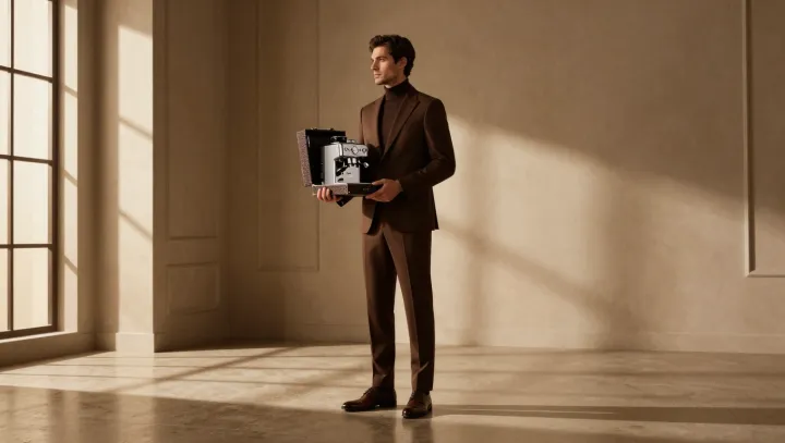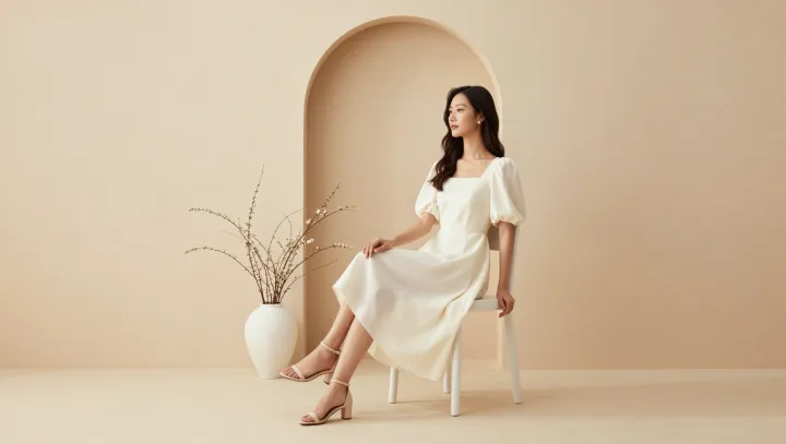
A pale cheek beside a quiet background can look lit from within, even when its measured pixel values have barely risen. That is no decorative trick. It is a wager on the visual system: remove competing chroma and harsh edges, and the face stops spending its light budget on defending itself.
Less can look brighter. Simultaneous contrast makes neighboring colors judge one another, so a crowded palette can pull attention away from skin and make every hue fight for notice. Reduce that competition, and the remaining warm-cool shifts carry more weight. The eye settles. Chromatic adaptation also matters: when the frame offers fewer saturated signals, neutral and lightly colored areas can appear cleaner, while modest blush or lip color gains presence without being pushed.
Soft contrast earns its reputation. Severe blacks beside abrupt highlights can make a face feel carved rather than illuminated, because luminance adaptation forces the eye to account for extreme ranges. Gentler tonal transitions preserve highlight rolloff and let midtones breathe. The result is not less light, but less argument about where light lives. A face need not shout to appear present; sometimes it glows because everything around it has learned restraint.