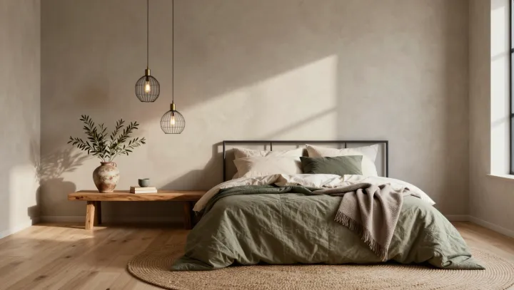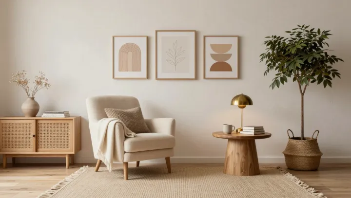
A pool of lamplight gathers on a wool throw, while the rest of the room recedes; that small withdrawal of spectacle is often what makes a reading corner feel costly. Less announces more. Where ornament competes for the eye, a chair, a side table, and a shaded lamp establish visual hierarchy, the quiet grammar of considered interiors.
Price often misfires. The nervous system does not invoice a room by purchase price: through sensory adaptation, it reduces its response to repeated, high-salience signals, whether they arrive as polished metal, crowded art, or branded objects. Clutter keeps billing. By contrast, low visual load permits attentional restoration; a legible perimeter and a protected seat borrow from prospect-refuge theory, giving the reader a sense of shelter without turning the corner into a stage. Austerity is not the point. The aim is edited density: fewer signals, each granted room to register, so texture replaces accumulation as the source of pleasure.
Restraint carries status. Materials that invite touch, including linen, timber, wool, and paper, deliver variation at close range, whereas glittering decor spends its effect from across the room and then has little left to say. Nearness changes everything. A corner designed for one body gains intimacy through scale: a lamp set below eye level, a surface within reach, and cushions with enough give to slow posture. The richest room may be the one that leaves part of itself unperformed, holding light like a secret after the page is turned.