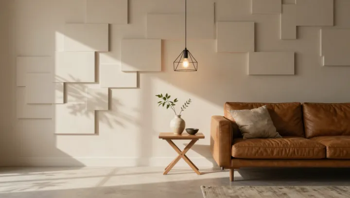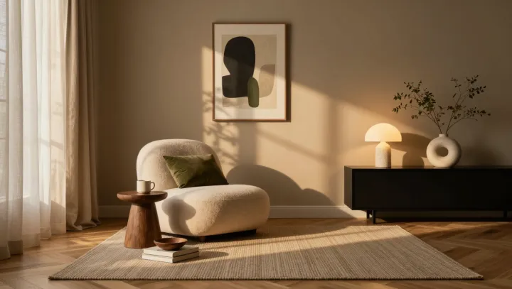
Late light quiets first. It catches a nubby wool throw, a clay lamp base, and the grain of an oak table; the room should feel crowded, yet it settles the eye. It resists clutter. When surfaces vary in weave, sheen, and scale but stay within related umbers, sands, and mosses, difference reads as family rather than noise.
Restraint does the work. Visual perception favors perceptual grouping: shared hue and value let the brain bind unlike materials into one legible set, while changes in texture offer detail without asking attention to reset. Contrast is rationed. A linen curtain can sit beside rough plaster and glazed ceramic because chromatic coherence reduces figure-ground competition, leaving attention free to wander instead of repeatedly deciding where it belongs. That unity is earned. The eye still notices variation, but files it under a shared tonal register instead of treating each surface as a fresh demand.
More texture is not better. Calm appears when scale is edited: a broad, matte wall can act as a visual resting place, whereas a tight cluster of tiny, unrelated patterns forces serial inspection and raises cognitive load. Let one texture lead. A coarse rug below, soft upholstery at hand level, and a faintly irregular vessel near the light can answer it through touch rather than competing color. Dusk offers proof. Many surfaces can occupy one fading color, although none gives up its particular grain.