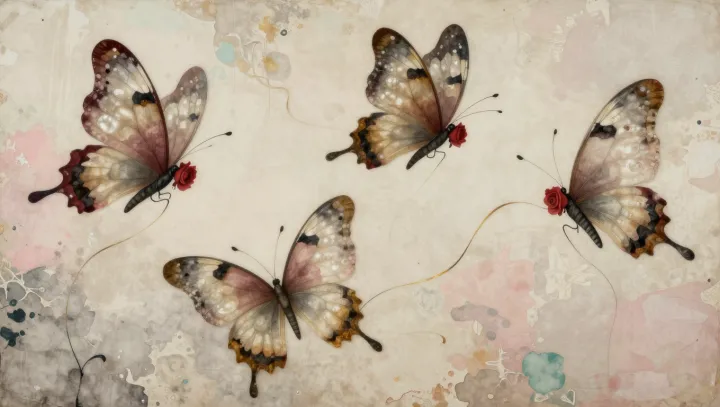
Flatness is no obstacle. Gray floral branches can appear farther away because their fading contrast and softened contours reproduce visual signals that the brain has learned to associate with distance. Weakness becomes a clue. When pale petals nearly merge with the paper, while darker stems retain distinct boundaries, the difference encourages a reading of depth rather than merely uneven ink.
Distance borrows from weather. In atmospheric perspective, light scattered along the viewing path reduces the contrast of distant objects, so an artist can suggest recession by recreating that contrast loss without adding any actual air between marks. Edges carry another hint. Softening a contour suppresses high spatial frequencies, the fine visual information that defines tiny details and abrupt boundaries, which can resemble detail loss in distant objects. Gray alone proves little. A pale branch may still look close if its outline remains crisp, because perceived distance depends on relationships among cues rather than on a single shade.
The trick needs company. Place a faint spray behind a darker, sharper branch, and relative contrast, edge sharpness, and any overlap can reinforce one another, making the suggested separation more convincing than softness would achieve alone. Blur is not distance. Because blurred contours can also signal an object outside the eye's focus, or simply a drawing style, the surrounding arrangement helps determine which interpretation the viewer accepts. Nothing physically moves backward. Yet where the darker stem holds its boundary and the pale blossom almost relinquishes its own, the paper seems to keep a little space between them.