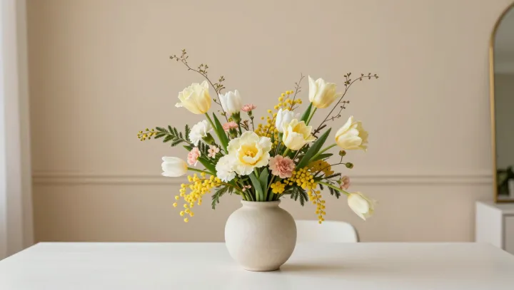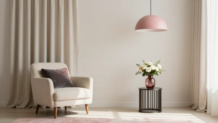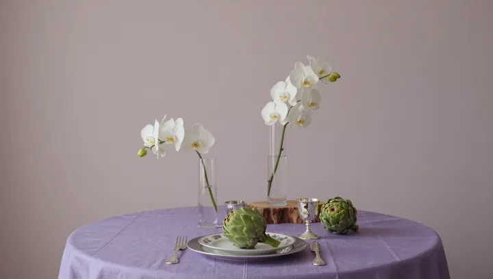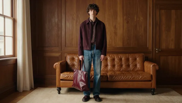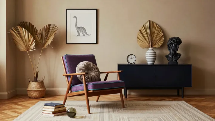
Natural wood makes bold upholstery easier to live with, not harder. Its grain gives the eye a continuous surface to return to, while purple and teal can occupy separate parts of an armchair without appearing disconnected. A neutral cushion adds breathing room. The effect is less a strict color match than a negotiated truce.
The finish does more work than its brown label suggests. Honey and amber woods carry yellow or orange undertones, which can lend warmth to blue leaning teal and make a muted plum feel richer by contrast. Reddish woods can echo a purple fabric, though a strongly red finish beside a bright purple may compete for attention. Cooler, grayish woods often sit comfortably with blue violet and subdued teal. Saturation matters as well: two highly intense fabrics can overwhelm a delicate grain, while softened versions give the frame more presence. There are no automatic matches. A finish that looks golden beside one fabric may look more orange beside another.
The neutral cushion is most useful when it belongs to the same conversation. Cream can connect with a warm finish; a cooler gray can sit more naturally beside weathered wood, though either choice depends on the surrounding fabrics and light. Check the samples together. Place upholstery swatches and cushion fabric against the actual frame, then look at them in daylight and under the lamps used in the room. Light changes the apparent color of both wood and cloth, and a finish seen on a small sample may not reflect the grain across an entire chair. The most persuasive pairing leaves room for each color to speak, and for the wood to remain itself.