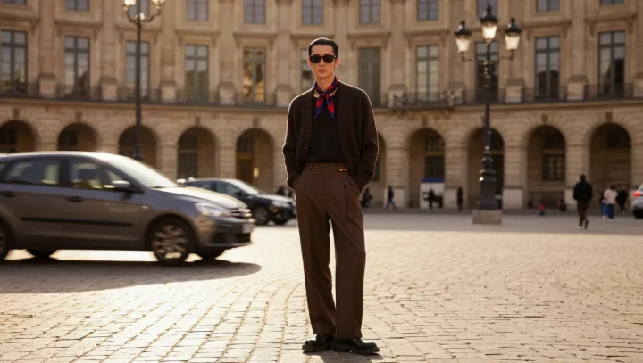
A bright scarf can command an outfit without commanding much space. Against a dark brown jacket and trousers, its color interrupts a broad, quiet field. The eye has somewhere to land. The effect is not a matter of size but of difference: a small accent stands apart precisely because the surrounding clothes do not compete.
Placement gives that contrast its force. Worn at the neck, the scarf sits close to the face, where attention often settles during conversation. Color contrast makes the fabric easier to distinguish from the jacket, while visual salience describes its tendency to stand out within the scene. The two effects work together. A flash of color at the ankle could also catch the eye, but it would draw attention away from the face rather than frame it.
Restraint is what makes the combination persuasive. The brown jacket and trousers provide continuity, allowing the scarf to act as an accent rather than one more item demanding notice. That does not mean every bright scarf will produce the same effect: its hue, pattern, size and the light in which it is seen can all change the balance. Nor must the rest of the outfit disappear. Texture and tailoring remain visible on closer inspection, even as the scarf supplies the first visual cue. The smallest piece holds the room for a moment; the quieter clothes give it a reason to be heard.