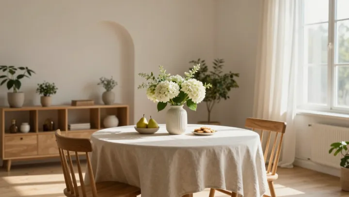
Pale bouquets work harder than bright ones. Not on the table, but inside the skull, where the visual cortex is constantly sorting outlines, contrasts, and color jumps into something coherent enough to feel like a scene rather than static.
The blunt truth is that a vibrant arrangement behaves like visual caffeine. High chromatic contrast and dense edges push more signals through the primary visual cortex and into attentional networks, forcing extra rounds of neural computation and short-term memory updating. Every saturated petal boundary becomes a tiny demand on feature detectors tuned to luminance contrast and color opponency. The result is not just “pretty” but physiologically busier sensory processing, with higher arousal in systems that track novelty and salience.
By contrast, those so-called boring, washed-out stems lower the workload. Fewer competing edges mean less activity in contour integration circuits; tighter clustering around similar hues reduces chromatic adaptation jumps; smoother luminance gradients blunt the need for constant gain control. The scene becomes easier to encode, so autonomic responses can drift downward. What looks plain on the vase is, for the brain, a rare luxury: a field of low visual entropy where almost nothing shouts for attention at once.