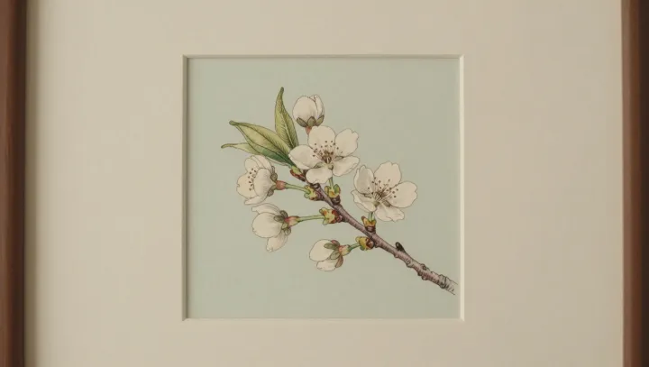
Flat paper often behaves like a better lab bench than a glossy screen full of petals and glare. By stripping a flower to a few calibrated lines and muted tones, minimalist prints cut what vision scientists call luminance and chromatic noise, giving the visual cortex less clutter and more signal to work with.
The counterintuitive part is simple. Less picture, more anatomy. When illustrators suppress saturated color and background texture, they free up attentional resources to track sepal count, phyllotaxis patterns, and vein branching instead of wrestling with reflections, depth of field artifacts, or compression blur baked into many photographs. Psychophysics studies on visual search show that high‑contrast edges and simplified contours speed up feature detection, which means a sparse outline can make a leaf’s midrib and secondary venation pop far faster than a lush macro shot.
What looks like decor is, at heart, a data filter. Minimalist prints act as a kind of analog pre‑processing layer, performing the same job for the eye that image segmentation and noise reduction do for digital analysis, isolating diagnostically important structures and discarding the rest. Hyper‑real images promise everything at once; the reduced drawing, by design, tells the brain where to look first.