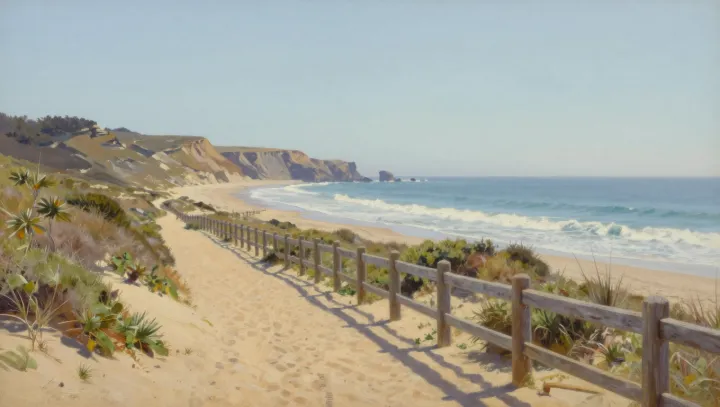
A simple coastal path feels less factual in a photo than in paint. That is not a failure of optics but a quiet revolt against them, as painters reengineer depth, contrast, and color to match perception rather than the sensor. The cliff face may be tilted, the path widened, the horizon nudged up, all to mimic how binocular vision and head movement stitch a scene over time instead of in a single static exposure.
Painters argue, in practice if not in words, that strict linear perspective is a narrow model. So a path might subtly fan outward, or a railing curve more sharply, echoing how peripheral vision and saccadic eye movements exaggerate near-field scale. Edge contrast gets the same treatment: boundaries between rock and sky gain heightened local contrast and sharper value jumps, exploiting lateral inhibition in the retina to make forms snap forward with a clarity no unedited photograph can sustain across the frame.
Most radical is their approach to color temperature. Where optics dictate cooler distance and warmer foreground, a painter may reverse the gradient, cooling the sunlit foreground to push it back and warming distant cliffs so they glow with remembered light. This runs against white balance logic yet aligns with color constancy and emotional memory, turning a modest path and cliffside into something that feels less like a record and more like the way the place lives in the mind.