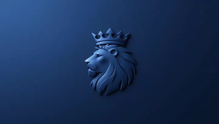
A flat crowned lion beats a majestic painted lion on the one metric brands care about most: stickiness. The shift from a modest blue crest to a stylized animal mark is less about aesthetics than about how the visual cortex fires under pressure, when a logo has only a fraction of a second to register.
The bold claim from neuroscientists is simple. Fewer details win. Under electroencephalography and functional MRI, high‑contrast geometric icons trigger faster spikes in the ventral visual stream than complex, shaded illustrations that demand more feature integration in the inferotemporal cortex. The crowned lion, reduced to sharp contours and a single color field, creates a clean signal with minimal neural noise, which shortens recognition time and frees working memory for brand association rather than object parsing.
Brand strategists rarely admit it, but the old blue crest was a cognitive burden. Its ornaments, gradients and micro‑lines looked refined yet scattered attention across too many low‑salience cues. By collapsing that heritage into a crown, a mane outline and a frontal gaze, designers aligned with the brain’s bias for canonical animal shapes and Gestalt grouping. Eye‑tracking shows quicker saccades and longer fixations on the simplified lion, while recall tests reveal higher hit rates after brief exposure. In stripping away realism, the logo stopped telling a story and started leaving a trace.