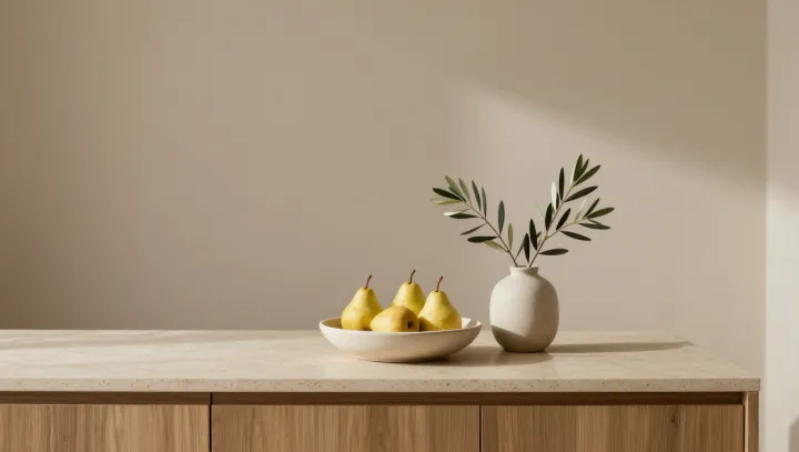
A bowl of pears does more for tired eyes than most designer objects on a shelf. Not because it is poetic. Because it is optically stable, chromatically quiet, and neurologically easy to process, according to visual ergonomics research and color science.
The first advantage is blunt. Pears usually sit in a narrow band of low to mid saturation yellows and greens, which sit close to the so‑called comfort zone of human color perception and demand less activity from retinal photoreceptors and the visual cortex than neon hues or high gloss metals. Their matte or softly textured surfaces limit specular reflection, cutting down abrupt luminance spikes that force frequent pupil constriction and dilation, a key driver of visual fatigue in cluttered interiors packed with reflective finishes and LED highlights.
A second, less obvious gain comes from predictability. A few similarly sized pears form a simple Gestalt: repeated shapes, clear edges, low informational entropy. Eye‑tracking studies show that such low complexity scenes reduce saccadic eye movements and micro‑refocusing events compared with shelves loaded with asymmetrical art toys, typography prints, or mirrored objects. Fewer saccades mean less strain on the extraocular muscles and smoother accommodation, which translates into a calmer subjective sense of the room even when overall light levels remain unchanged.
There is also a quiet physiological trick at work. The organic curvature and gradual shading of each pear provide gentle luminance gradients that support depth perception without forcing binocular rivalry, unlike sharply faceted decor that creates hard contrast edges at multiple depths. This aligns with principles used in human factors design for cockpit interfaces, where moderate contrast and low spatial frequency patterns are preferred to keep visual load within a sustainable band. On a coffee table or sideboard, the same rules apply, only wrapped in fruit rather than industrial hardware.