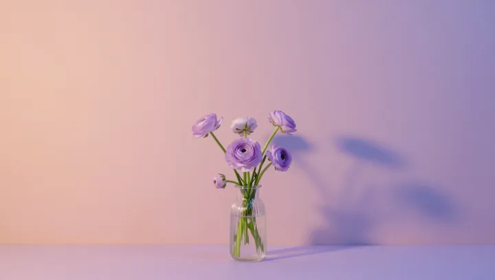
Harsh light is mostly a story about contrast, not power. Midday sunlight blasts the same energy through a room, yet soft pastel walls and pale pink petals edit the script that reaches the brain. Instead of dark objects next to blinding highlights, the scene becomes a narrow band of brightness, so the visual system stops firing its internal alarm for glare.
Key here is contrast adaptation. Photoreceptors and retinal ganglion cells compress extreme luminance contrast, but they still flag sharp edges, saturated hues, and specular reflections as visually aggressive. Pastel pigments reflect light in a broad, even spectral curve and dampen local contrast, so edges blur slightly in the signal that climbs toward the visual cortex. The physical illuminance stays high; the neural code for “too intense” quiets down.
Color temperature bias adds another twist. People read bluish light as colder and harsher, even at identical illuminance. Pale pink flowers and warm-toned walls shift the dominant wavelengths toward the longer end, nudging the scene into a warmer perceptual category through basic color constancy mechanisms. The brain reinterprets the same photon stream as friendly, not hostile.
There is also geometry. Matte pastel surfaces scatter light through diffuse reflection instead of mirror-like glare, trimming high-frequency patterns that trigger visual discomfort and even photophobia in sensitive observers. So the sun stays fierce at the window, yet on those soft walls and pale blooms it arrives already disarmed.