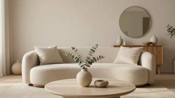
A beige sofa often does more emotional work than a red one. The claim sounds backwards until you ask what the brain actually wants from a room: not drama, but stable signals. When designers turn down bright hues and lean on warm neutrals, they are hacking basic vision science, not chasing a trend.
The blunt truth is that bright, saturated color acts like sensory caffeine. It drives strong activation in the visual cortex and forces constant micro-adjustments in color constancy, the process that keeps a white wall looking white under different light. That load does not feel like stress in a medical sense, but it does keep attention slightly on guard, so the space reads as active before a single person walks in.
By contrast, warm neutrals lower that background noise. Fewer competing wavelengths mean the occipital lobe can shift resources from raw color processing toward edges, faces, and motion detection. Texture suddenly matters. A nubby wool throw, a matte plaster wall, the shadow under a chair leg register more clearly, and those tiny cues are what the brain uses to infer warmth, softness, and safety.
Designers also argue that muted palettes make rooms feel more alive because people become the brightest objects in view. Skin tones sit in the same warm spectrum as creams and taupes, so social cues integrate smoothly under ambient lighting, a win for social cognition. The room stops competing with its occupants for salience, and the nervous system quietly tags the space as hospitable rather than theatrical.