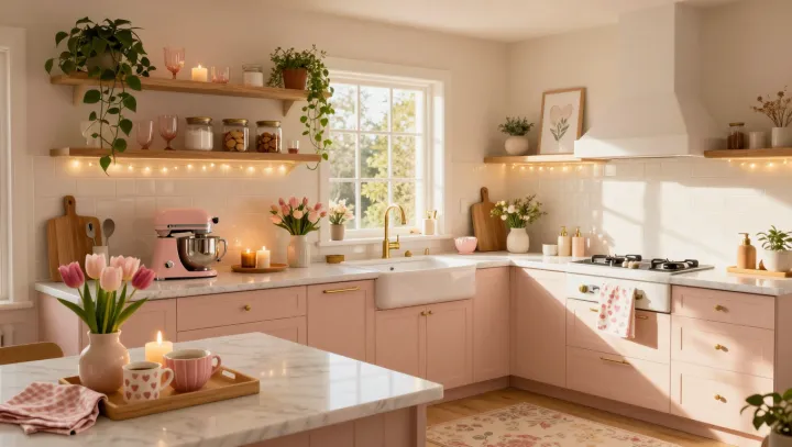
Pink surfaces make the better argument: they catch a lamp's amber spill before the eye has time to name it, sending a softened red-biased return across counters, cabinet fronts, and skin. The room settles first. Under warm illumination, spectral reflectance shifts the light returning to the observer toward longer wavelengths, so the kitchen reads as gentler rather than merely colored.
That calm is not a decorating trick; it is visual physiology at work. Chromatic adaptation lets the visual system recalibrate to the prevailing cast of light, while pink, unlike a stark white surface, returns fewer cool components that can make a warm bulb feel clinical. It softens edges. Because color perception is comparative, surrounding timber, stone, and matte finishes shape the result, whereas glossy planes can introduce glare and fracture the effect.
Plants should not be asked to match. Their green looks cleaner beside pink because simultaneous contrast heightens differences between neighboring hues; foliage becomes an accent, not another layer of the same color. The contrast has a job. A few distinct leaf shapes create hierarchy, while crowded pots, labels, and dangling tools compete for attention. Pink holds the light; green interrupts it. Between them, the kitchen can feel composed without feeling staged.