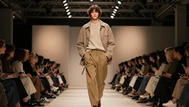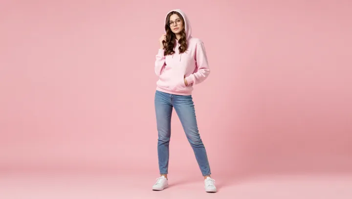
A muted hoodie and anonymous skinny jeans can look richer than a logo-splashed runway jacket. That is not about taste. It is about how the visual system ranks signals. Low-contrast color blocks demand less neural effort in the primary visual cortex, so the outfit reads as stable, controlled, already edited.
Quiet pastels sit close together in luminance and hue, which reduces edge detection events and micro-saccades; the brain interprets that reduced “visual noise” as coherence, and coherence often gets coded as quality. Designers pay for that effect with “color grading” and strict palette curation, yet a drugstore hoodie can trigger the same response if it stays within a tight chromatic band.
The skinny jeans do a different job. They create a single continuous contour, which plugs directly into Gestalt continuity and figure-ground segregation. Fewer breaks in the silhouette mean less segmentation work for the occipito-parietal pathway, so the viewer experiences one clean line rather than a stack of competing shapes. Against that calm structure, hardware, logos and aggressive prints start to look like compression artifacts on an otherwise high-resolution image.