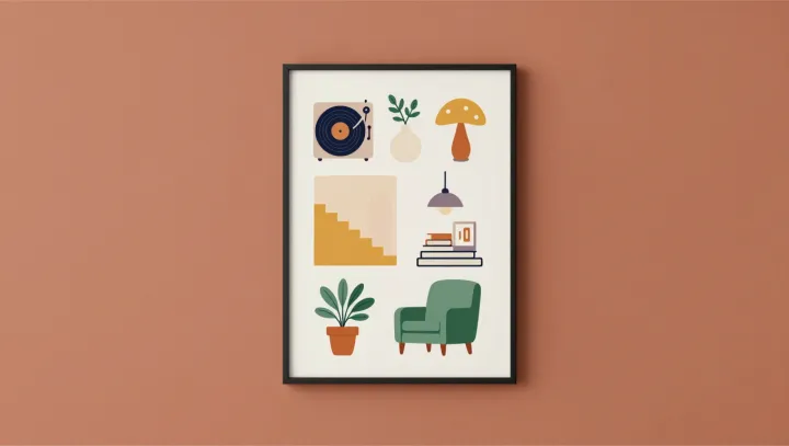
A flat poster with a plant, a lamp, and a chair will often beat a photorealistic living room in your memory race. That is not a quirk. It is how the system is wired. Visual memory, from early sensory encoding to long term storage, is biased toward bold, low entropy icons that carve clear boundaries in the neural noise.
The brain, bluntly, hates clutter. Within milliseconds, the visual cortex runs feature extraction and figure–ground segregation, stripping away shadows, fabric textures, and wall decor that overload limited working memory capacity. What survives this compression pipeline are high-contrast shapes with simple geometry, which place a lighter load on synaptic plasticity and make pattern completion easier when you later try to recall the scene.
Simple posters win because they cooperate with that compression. One plant. One lamp. One chair. Each object sits like an icon in a user interface, spaced apart, minimizing interference in the hippocampus as it performs pattern separation. Dense room photos, packed with edge detail and overlapping contours, force similar neural ensembles to fire, increasing noise and making later recognition less reliable than the clean, almost cartoonish version.
The unsettling implication is this: memory does not honor realism, it honors legibility. Advertising, interface design, even classroom diagrams that strip scenes down to a few high-gain symbols are not childish; they are aligned with the biological codec your neurons already use.