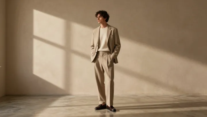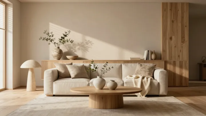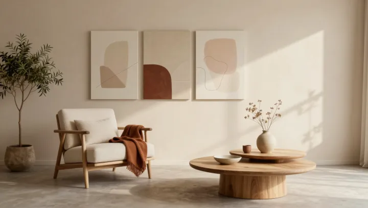
Restraint reveals more. Amber light catches a nubby wool sleeve, then slips across a chalky wall and a brass clasp; the room looks quieter, yet its surfaces become easier to read. Less color, more evidence. The effect is not meekness. A restrained warm-neutral range lowers chromatic competition, allowing edge definition, material grain, and proportion to carry the eye's attention.
The trick is perceptual. Under simultaneous contrast, strongly varied hues recruit attention from adjacent forms; when their saturation and temperature sit close together, luminance contrast and shadow gradients take over, making a seam, pleat, or matte-to-gloss shift seem deliberately placed rather than accidentally loud. The eye gets room. Color does less. Form does more. Chromatic adaptation also settles quickly in a narrow palette, so a single rust stitch or dark cuff arrives as a controlled interruption, not a plea for notice.
That hierarchy is the point. A silhouette gains authority when its contour is not forced to compete with a dozen hue changes; a quiet field lets volume, fit, and negative space announce themselves in sequence. Accents earn their wage. A small flash of oxidation, stitching, or polished metal can then signal use or craft because it breaks an expected pattern, not because it overwhelms it. Its force comes from scarcity, a basic principle of visual hierarchy that turns restraint into direction. At the room's edge, the brass clasp need not shout; against its calm field, it simply holds the last light.