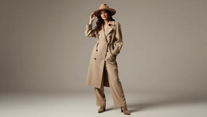
Beige earns its reputation when light grazes a wool sleeve: color recedes, and the eye begins measuring the seam, the nap, the slight break at the cuff. It is not bland. It is an edit, stripping chromatic competition from the frame.
The effect is less mystical than it looks. When hue contrast falls, visual attention shifts toward other signals, including edge definition, drape, and proportion. Low chroma lowers feature competition; texture and construction gain perceptual weight. Not simplicity, but hierarchy. A ribbed knit, a sharply pressed trouser crease, or a coat with disciplined shoulder geometry can register more clearly because loud color no longer claims the first glance.
That restraint also makes poor clothes harder to excuse. Beige exposes weak fabric, careless fit, and flattened shape with unusual honesty. Yet it rewards precision. In a neutral field, silhouette becomes the argument and material becomes the evidence. The quietest color can leave the most exacting question hanging in the air: is the garment carrying the wearer, or is the wearer carrying the garment?