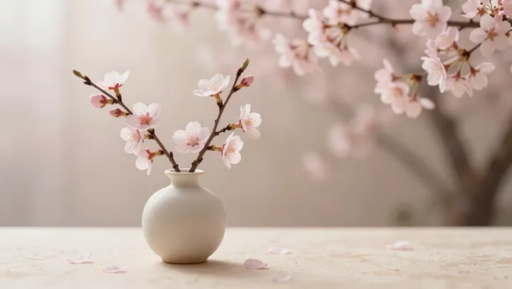
Pale blossoms at the edge do more than decorate an empty bed: against muted greens and grays, their low-light petals establish small points of visual weight, so the eye begins measuring intervals rather than counting objects. The trick is real. What appears to be abundance is often perceptual accounting, in which scattered accents make bare ground read as an arrangement.
Warm color is the sharper cheat. Reds, apricots, and yellows tend to advance perceptually, while cooler, desaturated surroundings seem to recede; simultaneous contrast magnifies the separation, giving each warm note an influence beyond its area. Attention clusters fast. Through figure-ground segregation and Gestalt grouping, the brain binds isolated marks into a legible pattern, then reads the gaps as intervals within a whole rather than evidence of shortage. That inference matters.
Restraint, oddly, is what makes the effect persuasive. Crowding ruins the bargain. A dense planting equalizes signals and dulls contrast, whereas a sparse one lets each bloom operate like punctuation, with empty space acting not as absence but as a frame that enlarges its apparent claim. It needs breathing room. Selective attention does the rest: contrast converts separation into a cue for significance, while repetition gives dispersed accents a shared grammar. Less can look richer. Designers exploit color temperature, spacing, and repetition because perception rewards relations more readily than inventory; the eye is not a census taker, and it judges the view by rhythms before totals. The soil carries light.