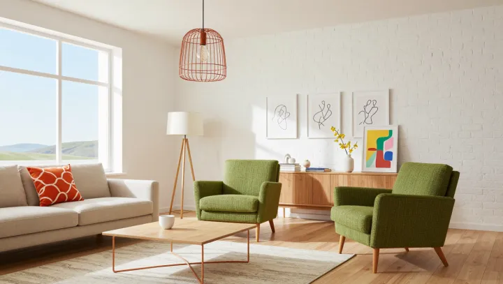
Empty space earns attention. A shelf with room around a few books can give their bindings and proportions more presence than a crowded arrangement, where every object competes with its neighbors. Restraint beats sheer quantity. In interior composition, negative space is the unoccupied area that helps define what remains, allowing a modest print or textured surface to register without an entourage of ornaments.
Abundance can flatten distinction. When books, framed images, candles, and souvenirs occupy every available surface, their overlapping outlines can weaken visual hierarchy, the ordering that tells the eye where to look first. Editing restores that order. Remove the objects that repeat the same color or shape, then leave enough separation for a chosen book stack and a print to read as distinct elements. Texture deserves breathing room. Against a quiet wall or an uncluttered tabletop, the irregular weave of linen, the grain of timber, and the rough edge of paper become visible details rather than background noise.
Personality survives the subtraction. The aim is not an apartment stripped of evidence that somebody lives there, but a room where possessions have enough space to reveal why they were kept. Books need not match. A worn novel beside an exhibition catalogue can say more about its owner than coordinated decorative volumes, especially when the shelf leaves their differences exposed. Blankness need not dominate. Leave a reading lamp, a useful table, and the print that rewards another glance; as light moves across the wall, the space beside its frame becomes part of what the room has to say.