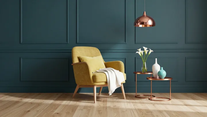
The yellow armchair looks louder against teal, though its upholstery has not changed. The wall does much of the work. Its cool blue-green hue sets the warm fabric apart, making the chair easier to distinguish than it might be against a beige or gray backdrop. The effect is visual, not a change in the fabric itself.
The eye judges color by company rather than in isolation. Simultaneous contrast describes how neighboring colors can shift one another's appearance; chromatic adaptation also affects perception as the visual system adjusts to surrounding light and color. Teal is not a precise complement of every yellow, but their separation in hue can make the upholstery seem more intense. Light matters, too. A dark teal wall can heighten the difference in brightness, while a pale or muted teal may produce a gentler effect. The result depends on the particular colors and lighting, not a guarantee that yellow will always glow.
The wood frame keeps the composition from becoming a contest. Its natural grain offers a quieter surface between the saturated wall and upholstery, while metallic accents can catch small points of light without requiring another broad field of color. Restraint has its uses. Too many reflective objects could compete with the chair rather than support it. What remains is a room built on a small visual paradox: the chair holds its color, yet the wall changes what that color seems to say.