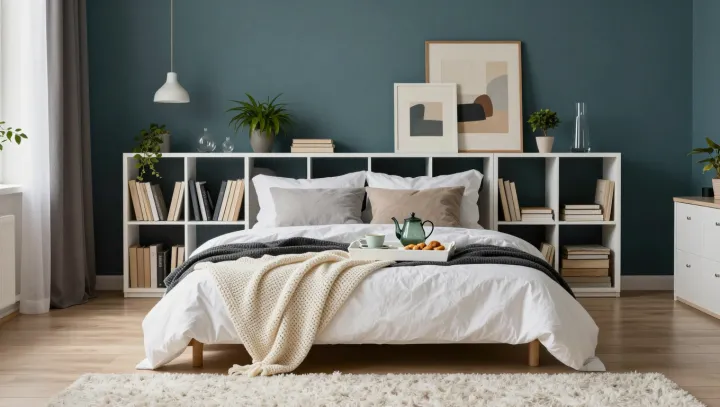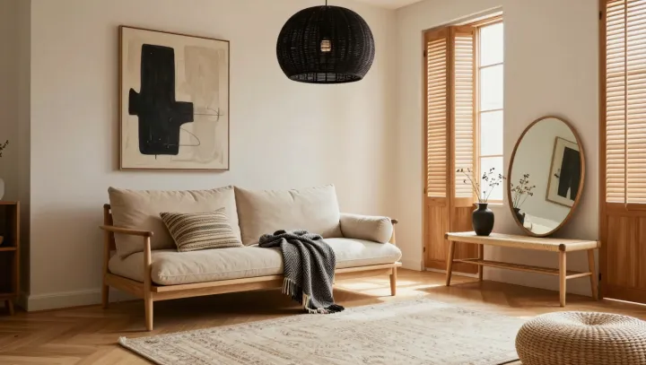
Beige is not a neutral bystander. Beside a pale oak table, a fabric with peach or yellow undertones can make the wood feel mellow; a beige that leans pink or gray can bring out a cooler cast. The table has not changed. Its neighbor has altered the terms of comparison.
Contrast is doing much of the work. Through simultaneous contrast, adjacent colors influence how each is perceived, so the same wood can seem different against fabrics with different undertones. Light complicates the judgment: its color temperature affects which wavelengths illuminate the surfaces, while metamerism can make materials that appear to match under one light diverge under another. A showroom pairing may look less convincing at home. Test swatches beside the actual furniture in daylight and under the lamps that will light the room after dark.
Texture keeps a restrained palette from turning flat. Linen, wool and visible wood grain scatter light differently, adding depth even when their colors sit close together; a few black accents, such as a lamp base or picture frame, give the eye a sharper edge without dominating the room. Keep the contrast measured. A large black rug can outweigh a delicate chair, while smaller dark details can anchor it. The most revealing test is also the simplest: leave the samples in place long enough to see the room shift around them. In the fading light, beige gives the wood its voice.